Windows 8.1 – the hands-on review
Windows 8.1 review: Microsoft's fresh Start?
Microsoft has made significant changes to Windows 8, making life for desktop users more like it used to be on Windows 7 - while aiming to keep tablet users happy
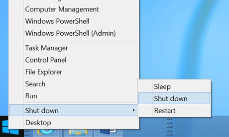
Right-click the 'Start' button in Windows 8.1 to get this familiar menu - including shutdown. Photograph: Microsoft
Last year Microsoft reimagined Windows. Windows 8 was released in October 2012, complete with a new touch-friendly personality intended to make the operating system work well on tablets as well as with keyboard and mouse.
It was a bold but controversial experiment. Users have not found it easy to adjust to the Windows 8 Start screen, which replaced the Start menu in Windows 7, and the Windows 8 app market is weak compared to that for Apple or Android apps. "I installed Windows 8 two months ago. I have yet to use a Metro app for anything," said developer Robert Smallshire on Twitter, where "Metro" refers to the new tablet apps which Microsoft officially calls "Modern" apps or Windows Store apps.
Most Windows users still live in the traditional desktop environment, which is why many Windows 8 tablets are "hybrids", with keyboards and trackpads as well as touch screens.
On Wednesday at its Build developer conference in San Francisco, Microsoft unveiled the preview of Windows 8.1, an update which refines the operating system without changing its character. I've been running the preview on the Surface Pro tablet given to all Build attendees.
No retreat
Microsoft is not backtracking on concepts such as the Start screen or the "immersive UI" which presents Modern apps without the clutter of visible menus and toolbars. Yes, there is a Start button on the desktop - but it takes you to the Start screen rather than restoring the menu in Windows 7. The Start button will be a point of familiarity for new users, but its main benefit is the enhanced administrative menu (known as Win-X because of its keyboard shortcut) which pops up if you right-click, including an option to shut down.
Users who want to avoid Modern apps have other new options, offered if you right-click the taskbar and choose properties. Here you will find "boot to desktop", the ability to list desktop apps first in the Start screen when sorted by category, and an option to default to the "All apps" view in Start. Unlike the mainly cosmetic Start button, these are significant changes. Engage them all, and when you tap Start you get a list of desktop apps grouped almost like the old menu, though it is not hierarchical. You can also show the desktop background in Start, making the transition to the Modern UI less jarring.
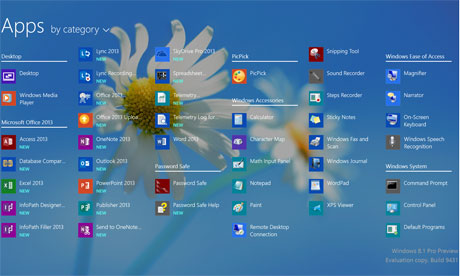 You can make this desktop-friendly app view the default in the 'start' screen. Photograph: Microsoft
The Start screen no longer shows all apps in the default tiled view, but only apps you select. It is also easier to customise Start groups. A swipe down takes you to the All apps view, unless you chose this as the default.
Snapped to it
Most of the changes in Windows 8.1 relate to Modern apps. In Windows 8.0, you can have up to two apps on view, with one snapped to the side. This snapped view has gone (a Microsoft engineer admitted to me that few people used it). If two apps are on view, you can now size them as you like by dragging a vertical bar, and if you have a large screen you can have up to four apps on view, though my Surface only accommodates two. Apps can also be written for two displays, with different data on each, so for example you could have a controller view and a presentation view. All good stuff.
New search
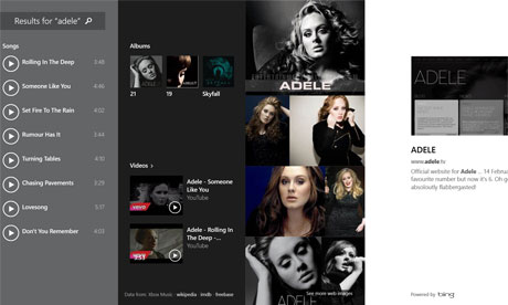 A search for Adele in the Bing app brings back results that look more like a media player. The app morphs according to the type of search. Photograph: Microsoft
The way Search works has changed. Previously, if you invoked search by pressing Win-S or selecting it from the right-hand Charms menu, you would be taken automatically to the Start screen. Now, search opens in a panel, and by default searches "Everywhere" rather than just Apps as before. One effect is that you can now easily open a new desktop app without ever leaving the desktop environment, using search as an app launcher. On the other hand, if you are searching more generally, you get results in a new Bing app that combines local and web search in a rich view. A search for "guardian", for example, shows Word documents with that word in the title as well as matching websites. Search for a celebrity and you get photos, biography, and for a musician, options to play songs in Xbox Music, the native music app on Windows 8.
Each search creates a kind of custom app, Microsoft explained, and this feature is fun to use. The prize for Microsoft is greater Bing adoption if the approach proves popular.
SkyDrive: now landing
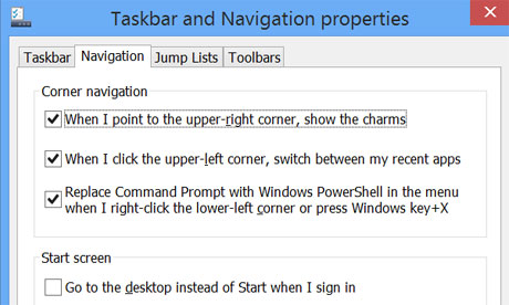 New navigation options, including boot to desktop, make Windows 8.1 more accommodating for desktop users. Photograph: Microsoft
SkyDrive, Microsoft's cloud storage, is deeply embedded in Windows 8.1. It has its own section in PC Settings, and you can opt to save all documents to SkyDrive by default. Open Notepad, for example, type something, hit save, and it goes to SkyDrive if you do not change the location. Another SkyDrive change is that the Modern SkyDrive app now works offline, sharing local storage with the Desktop version. This makes sense if you travel or regularly work on more than one machine.
Talking of PC Settings, Window 8.1 has more settings in the Modern settings app, reducing the need to run the old Control Panel. It is still not comprehensive. Mouse settings, for example, has just three options in PC settings, with many more in Control Panel. This is an improvement though.
PC Settings is also the place for new features like Workplace, which when combined with the forthcoming update to Windows Server will let users access a business network under the control of IT administrators, but without the full "domain join" that corporate machines normally require. This is in keeping with the Bring Your Own Device trend, where a machine is used both for home and business. Combined with another feature called work folders, this lets users synchronize with documents on their business network, while allowing the IT administrator to switch off access if the machine is lost or the employee leaves.
Turning IE up to 11
Windows 8.1 comes with version 11 of Internet Explorer (IE), which will also be available for Windows 7. The big new feature is WebGL (Web Graphics Library) support, a standard for showing 3D accelerated graphics in the browser without a plug-in, and ideal for browser-based games. Previously Microsoft had resisted WebGL because of security concerns, which it says are now resolved thanks to improvements both in the standard and in IE itself. There is also better touch support and faster performance, though I have not noticed much difference in day to day browsing so far.
The presence of two versions of IE in Windows 8 - one on the Start screen, one on the desktop - remains confusing.
Fun in Store?
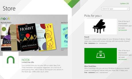 The Windows Store has a more appealing home page and easier navigation. Photograph: Microsoft
The Windows Store has been revamped. The home page is more appealing and magazine-like, categories are selected from the top menu rather than by endless scrolling, and apps now update automatically if you allow it.
What about the built-in apps? A new recipe app has what looks like a brilliant feature, called Hands-Free mode. If your machine has a front-facing camera, you wave your hand to navigate pages, avoiding touching the screen with sticky fingers. Unfortunately this hardly works on my Surface, suggesting that Microsoft has more work to do here, or that it is fussy about the exact hardware you use.
I had better luck with Reading List, essentially an app which lists shortcuts for future reference. Run Modern IE, for example, and you can add links to the Reading List using Share on the Charms menu. This also works with maps and other apps.
Mailed it
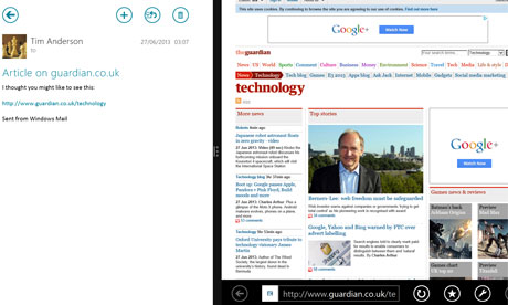 The Mail app can now show a web link side by side. Photograph: Microsoft
The Mail app is slightly improved. When I tried to add my Exchange Server account, it actually told me why it was not working (a digital certificate issue), whereas the old Mail app used to fail with infuriating silence. You can also view web links with an automatic side-by-side view, making a better experience.
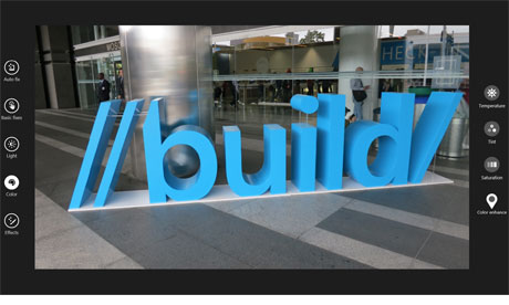 The new photo app, with an edit option for fine-tuning the image Photograph: Microsoft
The Photo app now has an Edit feature with a range of options for adjusting the colour, tint, light and various effects. It is easy to use and effective.
Conclusion
Windows 8.1 is a significant improvement. After just a short spell with the preview, I do not want to go back. The experience for desktop users (which is most users most of the time) is smoother, and there are many small enhancements which combine make a big difference, of which I have mentioned only a few.
But is it enough to fix the poor reputation of Windows 8, to persuade users sticking with Windows 7 to upgrade, or even to win sales that would otherwise go to iPad or Android tablets? Redmonk analyst James Governor is optimistic. "It's a long game," he told me. "You remember Vista, which needed a significant refactoring, and what came out of it was a decent platform. The Bing integration is significant. The split personality is a problem, but Metro is beautiful and a step forward, and will increasingly be the kind of model people use to access apps."
All this chimes with me as a reviewer and early adopter; yet Microsoft is coming from behind in the tablet market, has many users reluctant to relearn how they work with Windows, and its hardware partners are creating largely hybrid devices that are expensive and compromised - though also more powerful - compared to their tablet rivals.
Windows 8.1 is a refinement, but doesn't remove these obstacles.
I am writing this at Microsoft's developer conference, and the effort to win over developers to the new Modern platform is key. Just a few compelling apps will drive adoption; and it may even be that the new Bing app is one such in the way it combines local and web search in a single and appealing package.
Overall, it is too early to call Windows 8.1 a success, but also too soon to call the Windows 8 project a failure. Microsoft had done good work, and those who disliked the first release may want to take another look.
Preview: where to get it
You can get the preview at http://preview.windows.com, but be warned that there is no uninstall and it may not be possible to upgrade to the final version without a complete reinstall. In other words, it is not yet ready for general use.


0 comments: